Charts and Metrics
Investing builds upon trust. And the same way we like to know our friends really well before loaning them money, we should understand our investments before committing to them. Throughout the site, we characterize our portfolios with the help of charts and metrics. This post explains which of these we use and how to interpret them.
Investment Returns
The primary objective of investing is to make a profit. Consequently, most investors first wonder about their return on investment.
In its purest form, we invest a dollar amount, wait patiently for our investment to grow, and get paid a larger amount later. Here is what this looks like in our metrics:

The example shows how our Pick Me Up strategy grew a hypothetical investment of $1,000 made in January 2007 to more than $4,500 in April 2020. To put this number in context, we use benchmarks. In this example, we use SPDR’s S&P 500 ETF (SPY) as a reference, learning that Pick Me Up outperformed the benchmark.
While these absolute numbers are very intuitive, they are not always easy to compare. To address this issue, we calculate the Compound Annual Growth Rate, often abbreviated as CAGR.

This number expresses the growth of our investment as an annual percentage. Our Pick Me Up strategy grows by slightly more than 12% per year over the simulation period. This number assumes that all gains stay invested; they are continuously compounded.
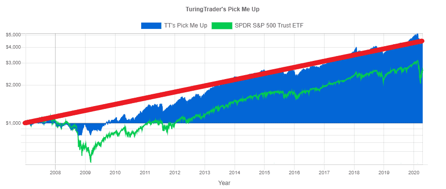
We can find the same information on the Equity Chart. Horizontally, we see the time axis: starting in January 2007 and ending in April 2020. Then, vertically, we have the dollar value of our investment: starting at $1,000 and ending at $4,500.
Please note that we scale the vertical axis logarithmically. This type of scaling has several advantages over linear scaling:
- Equal growth factors, e.g., a doubling in value, result in the same vertical distance: the distance from $1,000 to $2,000 is the same as the distance from $2,000 to $4,000.
- The resulting chart shows a straight line if an investment grows at a constant rate.
- If two investments grow at the same rate, their equity curves are parallel.
The CAGR cannot be found directly on the chart. However, we find it represented by the slope of the equity curve: the steeper the slope, the higher the growth rate.
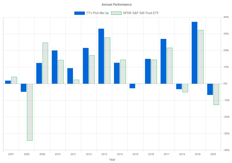
Most investments fail to provide steady returns with a constant growth rate. Instead, their growth rate fluctuates, making it difficult to read from the chart. Here, a bar chart showing the annual returns comes in handy. Horizontally, we see the calendar years, and vertically we plot the growth rate for the respective calendar year.
While this is a familiar and handy representation, it has some shortcomings. For once, it does not show what happened between the year's beginning and end: this path could have been all but smooth. Also, any gains or losses close to the end of the year induce some misleading jitters here.
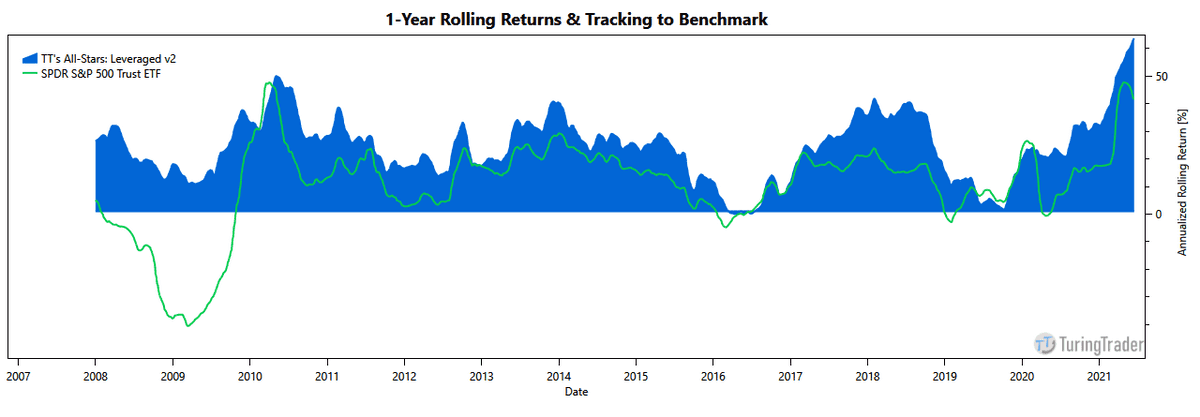
Calculating rolling 12-months returns addresses this issue. Instead of discrete bars, we now have a smooth line representing our returns. This view makes it easy to spot periods of outsized returns or underperformance. Also, the raggedness of the curve provides an intuitive impression of the portfolio's volatility.
![]()
However, comparing portfolios remains difficult. This is where the tracking chart comes in. We create it by dividing the equity curve of our portfolio by the benchmark's curve. As a result, we can see how much better or worse than the benchmark a portfolio performed. If they perform the same, the line runs horizontally. If the portfolio beats the benchmark, the line slopes upwards.
Investment Risks
Losing money is a painful experience. Therefore, many of the charts and metrics aim to measure investment risks.
As we have seen above, returns are not constant but fluctuate over time. A measure for this fluctuation is the Standard Deviation of Returns or Volatility.

This number helps us estimate a range of likely investment returns. Our Pick Me Up strategy has a Compound Annual Growth Rate of about 12%, and its Standard Deviation of Returns is almost 16%. Statistically speaking, we have a likelihood of 68% that Pick Me Up will return between -4% (12% minus 16%) and +28% (12% plus 16%) annually. The bar chart above confirms that our Pick Me Up returns stay close to these bounds while there are, of course, no guarantees.
We like to point out that the Standard Deviation of Returns is higher than the Compound Annual Growth Rate for many strategies. In other words, volatility drowns the trend, and there is a substantial risk of losing money over a given 1-year period.
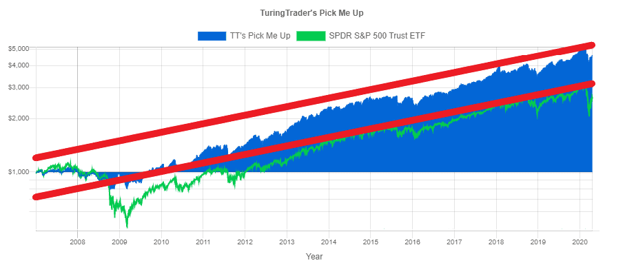
We can also find the same measure on our Equity Chart. If CAGR is the slope, then the Standard Deviation of Returns is the width of a corridor within which the equity curve ranges most of the time.
From a mathematical perspective, these may be useful measures, but many investors think differently: Investments are supposed to grow, and any reversal from that upward trajectory is considered a loss.
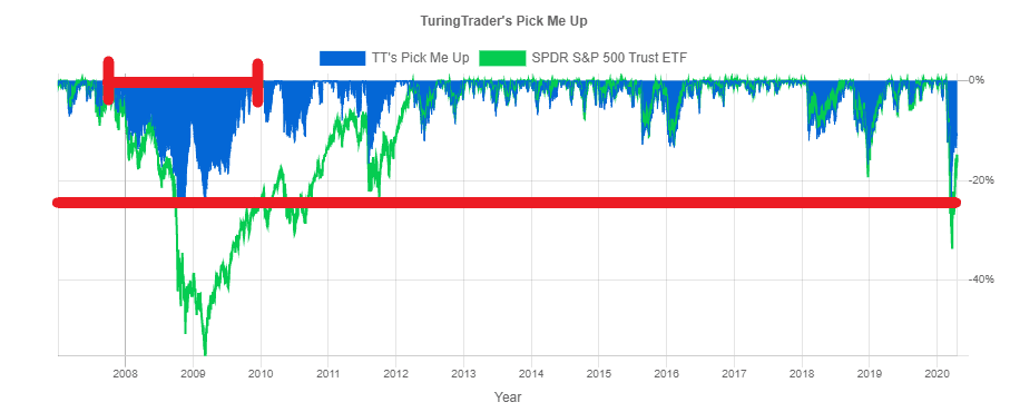
Underwater Charts reflect this view: they chart the percentage lost since a previous all-time high over time, the so-called drawdown. From the chart above, we learn that our Pick Me Up portfolio suffered its worst loss in late 2008, about 25% from its previous high. Further, we can see that the longest drawdown started in October 2007 and lasted until January 2010.
Our metrics show this information as follows:

In addition to the Maximum Drawdown, we also measure the Maximum Flat Days. This number is the longest time it took from one peak to making a new all-time high. With 805 days, this is more than two years. And even though that is a long time, this is still less than half of the benchmark.
We calculate the Maximum Drawdown at the end of each day. This leads to worse results than calculating drawdowns only at the end of the month.
Another way to quantify risk is the Ulcer Index. This index is the Root Mean Square of daily drawdowns.

Because the index uses squared drawdowns, it applies larger weights to more profound losses. Therefore, we can interpret the Ulcer Index as a representative drawdown, which our investment will reach frequently.
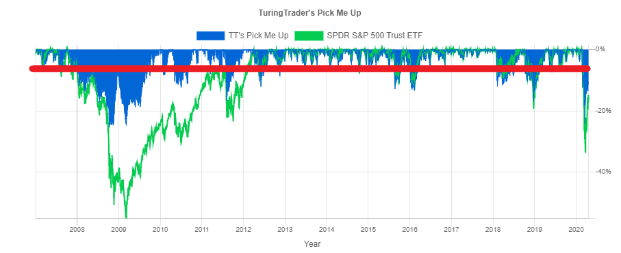
The chart above shows the Ulcer Index for our Pick Me Up strategy. Again, we see that the portfolio regularly reaches or exceeds this drawdown level.
Risk-Adjusted Returns
When working a regular job, we get paid for performing our duty. Similarly, as investors, we get paid for taking on risk, the so-called risk premium. By dividing a return measure by a risk measure, we calculate Risk-Adjusted Returns. In a nutshell, these measures express how well we get paid for taking on risks.

The most commonly used measure for risk-adjusted return is the Sharpe Ratio. At its core, it divides the Compound Annual Growth Rate by the Standard Deviation of Returns. However, there is an additional twist: we subtract the Risk-Free Rate of Return from the profits before performing these calculations. Doing so makes sense, as we are looking for a measure of taking on risk, and receiving risk-free interest is not that. In today's environment of low-interest rates, the risk-free rate is close to zero. However, this has not been the case in prior decades.
There are many ways to calculate the Sharpe Ratio, making this measure hard to compare. For TuringTrader.com, we chose to use monthly returns and annualize the results. For the risk-free rate, we use the Secondary Market Rate for the 3-Month Treasury Bill.
Another important measure for risk-adjusted return is the Ulcer Performance Index or Martin Ratio. This measure divides the CAGR by the Ulcer Index.
Our example shows how, according to the Sharpe Ratio, the Pick Me Up portfolio produces more than twice the return per unit of risk as a straight investment in the S&P 500 would. According to the Ulcer Performance Index, our Pick Me Up strategy achieves almost four times the risk-adjusted return of the S&P 500. When comparing portfolios, it is good practice to watch both measures.
Investors often believe that to achieve high returns, they have to take on high levels of risk. Risk-adjusted returns debunk that myth. Instead, investments with similar risk profiles may lead to very different profits, and Tactical Asset Allocation augments this effect.
Beta
Mathematically speaking, Beta is a measure of correlation. It is part of the Capital Asset Pricing Model and describes how much an investment moves in tandem with the market. Beta may seem desirable in bullish markets, as stocks with a Beta larger than one will provide amplified growth. In the context of portfolios, Beta is typically seen as a risk factor, though.

This makes sense, as a well-rounded portfolio should appreciate value throughout all economic seasons and independently from a single asset class's movements. On our site, we always measure Beta against the S&P 500, as stocks are the driver of growth in most portfolios and the most significant contributor to portfolio risk.
Monte-Carlo Simulations
Simulations of our strategies with historical data, so-called Backtests, are useful methods to analyze how the portfolios performed under past market conditions. However, even though markets go through cycles, history does not repeat itself exactly. Monte-Carlo Simulations address this issue by analyzing the range of possible outcomes based on given confidence intervals.
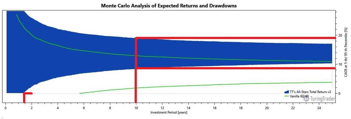
To evaluate a strategy's likely range of returns, we first calculate the distribution of monthly returns. Then, we run several thousand trials to create a set of equity curves, each representing an alternate reality based on the given distribution of returns. Next, we calculate an envelope of two equity curves, one representing the 5th percentile and the other the 95th percentile. Finally, we plot how the CAGR changes over time.
To read this chart, start on the horizontal axis, at the point representing your investment period. Next, read the upper and lower values for the CAGR on the vertical axis. The example above shows how, with a probability of 90%, All-Stars Total Return CAGR will fall between 8.5% and 19% after ten years. Also, the chart shows how, with a probability of 95%, the portfolio's return will be positive after about 1.5 years. In comparison, an investment in a 60/40 portfolio will fall between 2% and 13% in the same period.
These charts are valuable tools for determining suitability for an investor's personal circumstances, as they show the relationship between portfolio volatility and the investment horizon. To learn more about using these charts for financial planning, read our background article explaining our portfolio wizard.

For Drawdowns, the charts show how deep drawdowns might look like. Again, the process starts with creating a swarm of equity curves. However, this time, we analyze all drawdowns, regardless of how short-lived or insignificant they might be. Next, of these drawdowns, we select those 5% that go the deepest. Finally, we create an underwater curve at the 5th percentile of these deepest drawdowns. This chart represents the depth and duration we expect to see under prolonged bearish conditions, e.g., during a recession.
To read the chart, pick a point on the underwater curve and extend it to the horizontal or vertical axis. The example above shows that All-Stars Total Return might lose about 15% during a recession and might take about three years to recover from those losses. In comparison, a 60/40 portfolio might lose about 26% and take up to 9.5 years to recover.
It is worth noting that these charts do not attempt to show the maximum possible drawdown. Because the probability of reaching the maximum drawdown is zero, it is technically impossible to determine that number using Monte-Carlo methods. Instead, our number should give a reasonable and realistic guideline of losses during a recession - backed with 95% confidence.
Benchmarks
Benchmarks help to analyze strategies by putting the results in context. There is no set rule on which benchmark to use. Generally, we use benchmarks with a similar risk level as our investment but not necessarily the same asset classes.
We typically use a proxy for the overall stock market for aggressive stock growth strategies. Specifically, we use S&P 500 ETFs, which capture capital gains and dividends paid. This benchmark reflects that typical growth portfolios build on stocks, and we expect growth strategies to have a positive correlation to the stock market. Further, the benchmark allows a direct comparison of the strategy's ability to handle recession periods.
For less aggressive or cross-asset strategies, we use a Vanilla 60/40 portfolio. This benchmark reflects the goal of reducing portfolio volatility and is relevant because stock/bond portfolios are the ubiquitous approach to portfolio construction.
Portfolio Comparison
Before selecting a portfolio, reviewing and understanding many (if not all) of the metrics we provide for our portfolios is a good idea. But sometimes, we need a quicker way to compare the characteristics of portfolios.
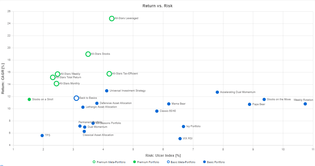
The risk-adjusted metrics above fit this bill as they relate the historical returns with the risk taken to achieve them. However, when selecting portfolios, it is helpful to consider returns and risks separately. Our portfolio-comparison chart does just that: On the horizontal axis, it shows the portfolio risk. Portfolios with lower risks are to the left, and portfolios with higher risks are to the right. On the vertical axis, the chart shows the portfolio returns. Higher returns are on the top, and lower returns are on the bottom. Because returns and risks are somewhat related, there is a natural tendency for portfolios with higher returns also to have higher risks.
To use the chart, pick an acceptable level of risk, e.g., an Ulcer Index of 3%. All portfolios matching this profile are on the left of this line. Among these portfolios, the ones with the highest returns are likely to be good choices, provided their other characteristics, e.g., investment style and rebalancing frequency, match your requirements.
Wrap-Up
TuringTrader.com offers a steadily growing selection of portfolios and strategies, along with background information, references, and daily updated charts and metrics. We very much hope that this guide helps you digest this wealth of information.

