Volatility Targeting
Further Reading
See Also
Related Strategies
While the Efficient Market Hypothesis suggests that no tactical asset allocation strategy should consistently alter the market's risk/return profile, this is not entirely true. There are known market anomalies, which we can exploit to create an edge. In this post, we take a closer look at the volatility anomaly.
Further, we like to show our approach to developing strategies. We start by analyzing the anomaly and develop a plan to use it to our benefit. Only then do we implement the strategy and confirm that backtesting matches our expectations. This flow ensures that we have a full understanding of our edge and the conditions under which it exists. Further, this way we avoid being overly focused on optimizing for pretty backtest results.
Setting the Goal
Before we start implementing a strategy, we need to set clear and achievable goals. We need these goals to stay on track and benchmark our results against them.
As a high-level concept, we want to invest in the U.S. stock market and U.S. Treasuries; both represented through diversified ETFs.
In bull markets, we want to maximize our exposure to the U.S. stock market. Similarly, we want to reduce our exposure to U.S. stocks in bear markets and flee into the safety of U.S. Treasury bonds. Further, we want to tilt our portfolio away from risky industries and toward those with lower volatility. To implement the latter, we are considering the eleven S&P 500 sector-ETFs.
In terms of performance, we want to beat the S&P 500 in the long term while only slightly lagging it during bull markets. The risk profile should be comparable to a passive 60/40 portfolio.
Understanding Conditional Expected Returns
To visualize market anomalies, charts of conditional expected returns come in handy. These charts plot the expected future performance of an asset against its historical conditions. Most often, we are interested in future returns, conditional on indicator values above or below a given threshold.
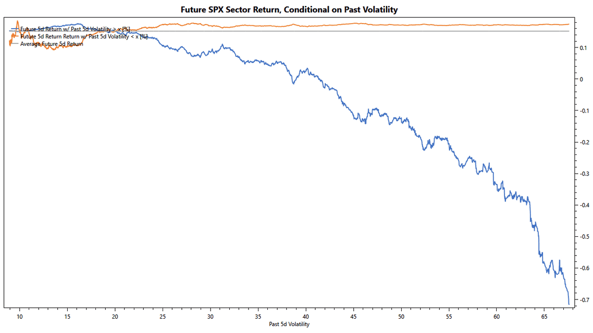
The chart above shows future returns, conditional on past metrics. On the vertical axis, we see the future 5-day return of the eleven S&P 500 sector-ETFs. On the horizontal axis, we show their annualized 5-day historical volatility. The blue line shows the expected performance for volatilities exceeding the value on the horizontal axis. In contrast, the orange line shows the same for volatilities below the value on the horizontal axis.
The following examples should help to interpret this chart:
- The average 5-day return is about 0.15%, as indicated by the grey horizontal line.
- The expected future 5-day return for volatilities larger than 20% is about average, as indicated by the blue line crossing the grey line at 20% volatility.
- If volatility exceeds 40%, the expected future 5-day return enters negative territory, as shown by the blue line diving below zero on the vertical axis, when volatility reaches 40%.
- The expected future return is above average for volatilities below any value between 20% and 70%. We can tell by the orange line staying above the grey line in this volatility range.
- Volatilities below 8% or above 70% combined occur less than 5% of the time. We consider them outliers and don't include them in the chart.
Following the Efficient Market Hypothesis, the lines on this chart should be flat, or random. However, this is not what we see. Instead, we see the blue line trending down, indicating a market anomaly. This anomaly suggests the expected future return is inversely related to volatility: expected return declines with rising volatility.
Defining a Simple Strategy
Once we have established a relationship between an indicator and expected returns, we can attempt to define a strategy. From the orange line in the chart above, we learned that we could achieve above-average returns by limiting volatility to an upper bound somewhere between 20% and 70%. Based on this finding, we can define the following simple strategy:
- Hold each of the eleven S&P 500 sector-ETFs, with historical volatility below X
- Hold cash, for any sector-ETF with historical volatility above X
Obviously, our strategy does not produce any returns while holding cash. To reflect the impact of holding cash on the total return, we need to time-weight the expected returns. The following chart does just that:
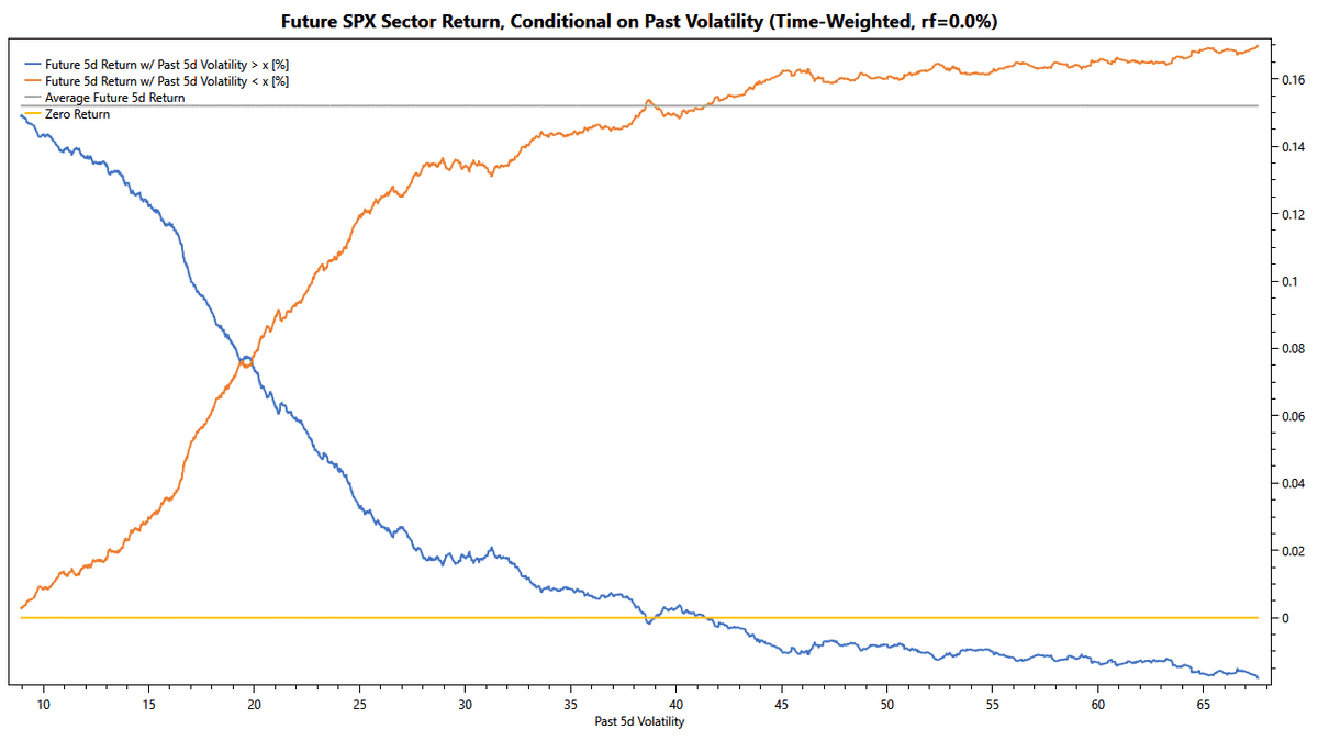
Remembering that the blue line indicates expected returns conditional on volatility above the threshold, we can infer that we hold cash more often the further we get to the right. On the rightmost edge of the graph, we will be all in cash, leading to a return of zero. Similarly, we hold cash for longer times the closer the orange line is to the left edge.
For our strategy, we choose to exit to cash at a volatility of 38.5%. At this volatility, the orange line crosses the grey line, indicating that the expected time-weighted return matches the average. With this volatility threshold, we can expect our simple strategy to produce returns equal to buy-and-hold. As we are holding cash in times of elevated volatilities, our resulting equity curve should show lower volatility than buy-and-hold.
Testing the Strategy
We designed our simple strategy based on the statistical distribution of returns and without even considering price movements in the time-domain. The chart below shows how closely the backtest matches our hypothetical results.
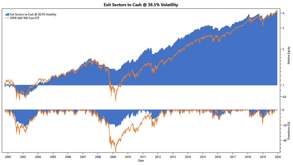
We can see how our strategy's total return is on par with buy-and-hold but with lower volatility. To gain more in-depth insight into this strategy's possible outcomes, we need to analyze the statistical distribution of returns. We like to use Monte-Carlo simulations to do so, as these charts provide an intuitive yet comprehensive overview of the risk/ return profile. The following chart shows the compound annual growth rate (CAGR) and maximum drawdown (MDD) for our simple strategy:
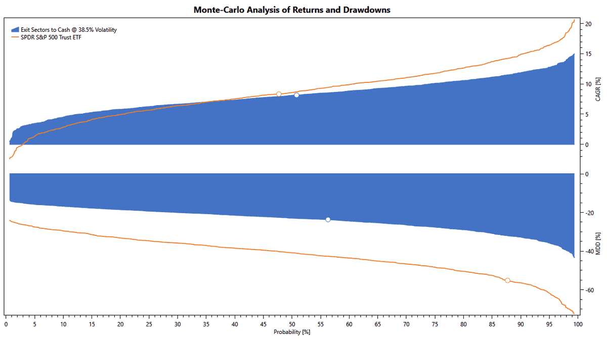
This chart confirms our observation from the backtest: This simple strategy provides returns on par with buy-and-hold but at much-reduced volatility.
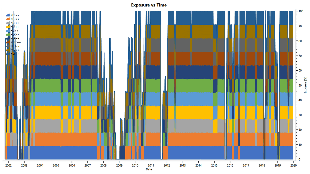
The following diagram shows how the strategy is exiting volatile sectors in favor of holding cash.
Introducing a Safe Asset
The main criticism of this simple strategy is the inefficiency of holding cash. An obvious improvement is introducing a safe asset: We replace sectors with a long-term U.S. Treasury Bond if the sector's volatility exceeds our threshold. This specific change leads to an immediate improvement of the equity curve:
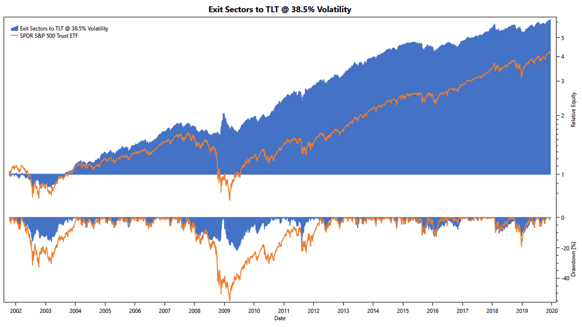
In addition to improving the return, we also further reduced the downside. This is possible because long-term Treasuries are negatively correlated to the stock market, making them an excellent choice for a safe asset.
Inverse Volatility-Weighting
While we made good progress with improving the simple strategy, some critical issues remain:
- Volatility threshold too far out. The current limit of 38.5% volatility is at the 88th percentile, raising the question of whether we optimized our strategy to filter outliers.
- Hard transition between sector-ETFs and safe assets. We aim to avoid hard transitions, as these might react to tiny differences in calculation results and lead to unexpected behavior.
- Transition to the safe asset instead of increasing the weight of low-volatility sectors. This conflicts with our goal of holding stocks as much as possible.
To solve these issues, we need to revisit the conditional expected returns from above. We notice the following characteristics:
- r5d, vol > x < r5d, vol < x with x > 20%
The chart shows this by the orange line being above the blue line. - r5d, vol > x < r5d, vol > y with x > y and y > 20%
These two findings express that volatility is an excellent ranking factor: For volatilities exceeding 20%, we can expect returns to decrease with increasing volatility. To turn this into a strategy, we weigh the eleven sector-ETFs inversely with their historical volatility. Also, we gradually reduce the overall exposure, based on the total volatility across all sectors:
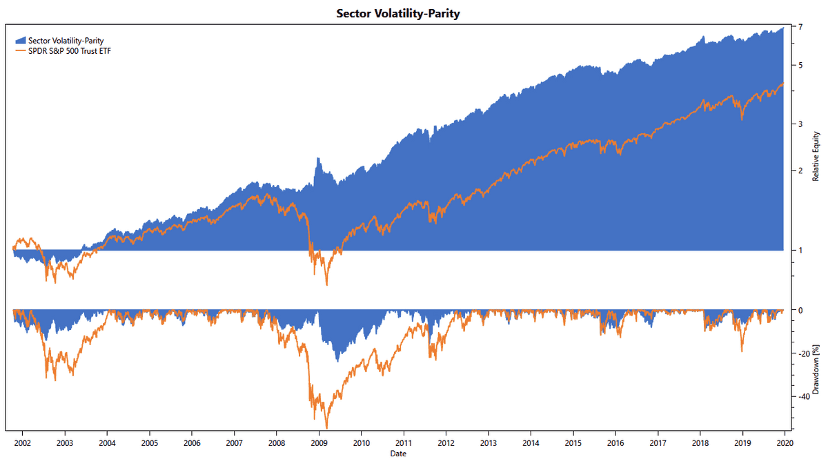
While this improvement has not done a lot to improve returns further, our confidence in robust out-of-sample results has risen much.
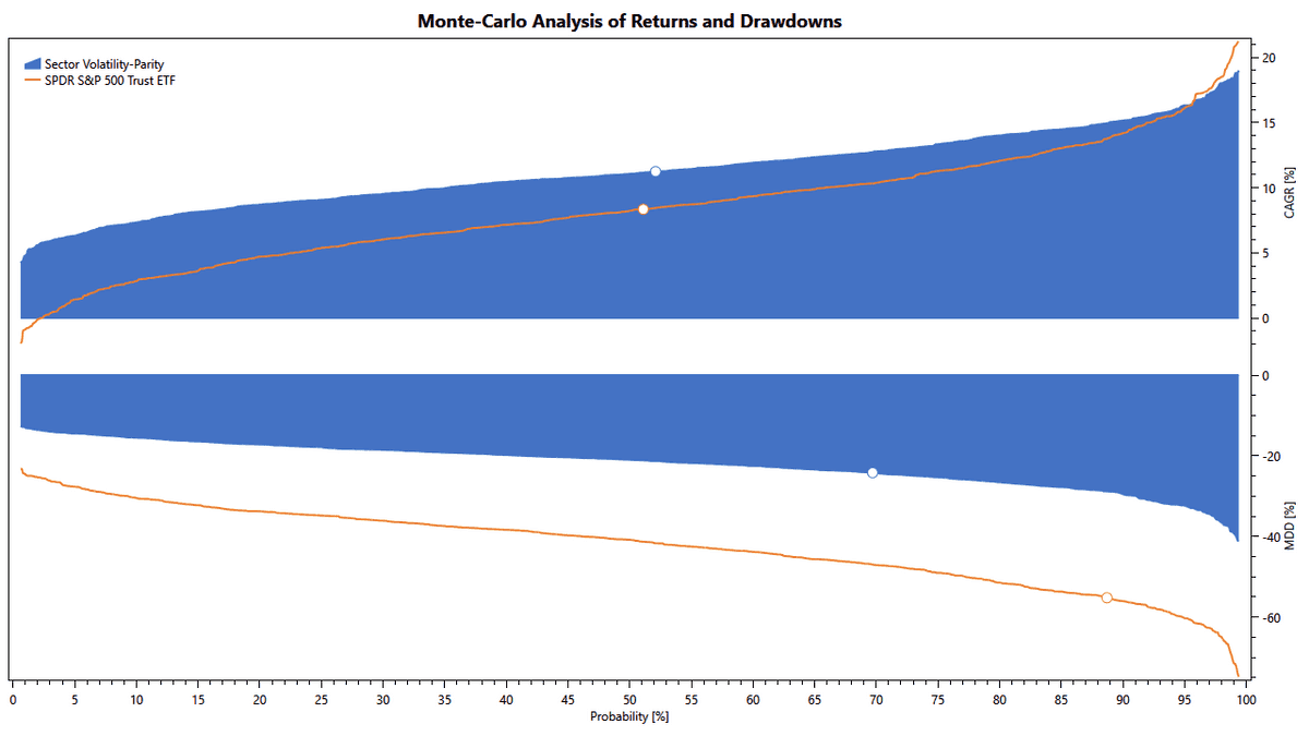
The Monte-Carlo simulation shows that the risk/ return profile has also improved: The curves for CAGR and MDD have become flatter, and as a result, the Sharpe Ratio has increased.
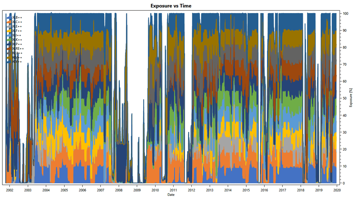
The diagram above shows how the strategy smoothly adjusts sector weights in favor of low-volatility sectors. Further, it shows the strategy existing S&P sectors and holding the safe asset instead.
Wrap-Up
This post shows that the U.S. stock market has an anomaly regarding volatility: Expected returns are dependent on historical volatility. Further, we have demonstrated step-by-step how to use these findings to design a profitable strategy, which meets our original goals and intent.
We hope this post has provided some valuable insight into our approach to quantitative trading. The findings in this post form the foundation of our following premium strategies:

